
Freehand Hatched Style in Adobe Illustrator, Part Three: Creating a Freehand Profile
/▷ Part One: Why Use Illustrator?
▷ Part Two: Basics of Graphic Styles
▶ Part Three: Creating a Freehand Profile
▷ Part Four: Scatter Brushes
Update Your Profile
If we want a wavy, freehand line in Illustrator, we could just draw it. But one advantage of this software is that it allows us to create profiles for our strokes. Profiles describe a variation in the thickness of a line and its offset from the path. They are primarily used to make lines similar to an artist’s brush: varying from thick to thin along their length. But we can create a profile that will maintain a consistent thickness — like a technical pen — but introduce some wiggle — like a line drawn freehand.
Here are some examples of profiles, all applied to the same paths:
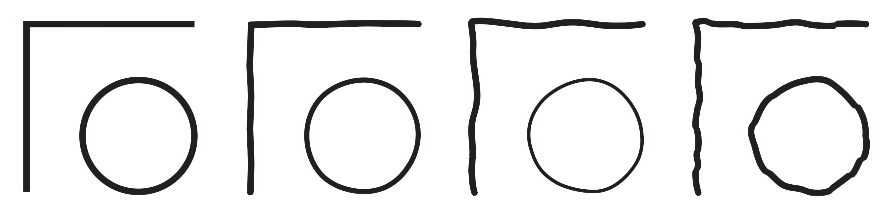
different Profiles applied to the same path give very different results
Profiles have a few limitations to consider as you experiment with them:
Profiles do not respect stroke weights. A very bumpy profile will appear thinner at the same weight. To maintain a consistent visual weight for your strokes, you’ll have to adjust its weight. Once you’ve done this, you can save it as a graphic style for reuse.
Profiles get stretched (or compressed) along their length. This means that with the same profile applied, a very short path may be too wavy and a very long path will be quite smooth. A remedy for this is to create variants with fewer or more hills and valleys.
Profiles become more pronounced as the stroke size increases. This means that a profile that looks great on a 1 point stroke may look too extreme on a 4 point stroke. Again, the remedy is to create variant profiles for different purposes.
Do the Wave
We’ll start by making a wavy profile that we can apply to our path. Start by making a path about 2” long — the length doesn’t really matter, but it’s convenient at the scale we’re using. By default it will probably be 1pt thick and black stroke with a white fill. Change the fill to “None” — we won’t need it for this.
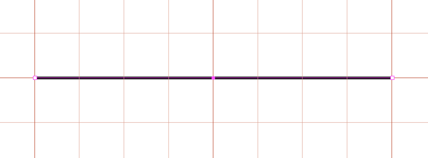
Draw a path
In this instance, we want to end up with a stroke that fills a .25” grid space for convenient grid layouts on our maps. So move the line .125” inch up so that it is centered in a grid square. This will allow you to use the grid lines as a visual indicator for the next step.

center the line on a grid square
Width Tool
Turn off Snap to Grid for this part. Hit SHIFT-W or select the Width tool from the toolbar. This tool will allow you to change the thickness of the path. experiment with the tool for a bit to see how it works on the path. Note that you can also grab the width handles where they cross the path and drag them back and forth.
If you hold down the OPTION key while you use the width tool, you can adjust just one side of the path at a time, and that’s what we’re going to do. We want to make a wavy line that undulates back and forth while remaining close to .25” wide along its length.
Now undo until you’ve reset the line back to its constant width of 1 point, or draw a new line to start fresh.
First, stretch the ends of the path out to .25 width. Then, using the Width tool with the OPTION key, adjust the sides to create a wavy profile.

Make slight curves with the Width tool to create a slight undulation to the profile.
TIP: You can double-click a width adjustment point to bring up a dialog showing the total width at that point and the width on each side of the path, if you want fine-tuned control.
Match the Ends
We need to match the ends, so that if the path is on a closed loop there won’t be a discontinuity where the line meets itself. To do this, we will make a copy of the line and place it at the end of the original.

The copy is shown in blue here for clarity.
Now lock the copy by selecting it and hitting COMMAND-2. This will keep you from editing the wrong path. Zoom in close to the matching ends.

The ends should match as shown.
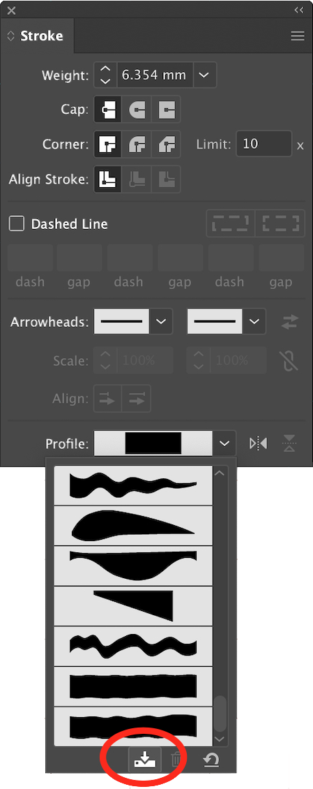
Save a profile in the Stroke panel under the Profile: pop-out.
Use the Width tool with OPTION to adjust the original profile until it matches the end of the copy. You may also need to adjust the next point in to ensure that the curve where they meet is smooth.
Now you can delete the copy.
If you find that your profile is too wavy
Save the Profile
You save the profile by selecting the path and clicking on Profile: in the Stroke panel. At the bottom of the pop-up is a small icon of a hard drive. Click on that to save the profile for later use.
When you save a profile, the width is not preserved, only the contour. You can scale the profile up and down by applying it to a stroke and then changing the weight of that stroke. You’ll be able to use this profile for lines that require the imperfection of a freehand line.
TIP: If you find that you don’t quite like how your profile turned out, you can always apply it to another path, set the weight to .25 inches for editing, adjust the contours, and save it again. Delete an unwanted profile by applying it to a path and then clicking the trash can icon in the Profile: pop-out.
In the next part of this tutorial, we’ll use the profile we created to make the outlines of our wall style.
TIP: There are several ways to create an undulating, freehand line in Illustrator. A similar result can be accomplished with Art brushes or Pattern brushes, or even a carefully-designed Scatter brush. One advantage of using Profiles for this purpose is that they will not introduce a large number of Bézier points, and so will not tax your processor while in a complicated drawing. Some other techniques we’ll be using will definitely add lots of points, so we are always looking for ways to reduce geometry when we can.

examples of wavy profiles shown at 10 point weight vs. 1 point weight. Notice the big waves settle down to a nice, irregular stroke at smaller sizes. We can use this to create the effect of a freehand stroke.
So, what is this for? We’ll use it to create a wall with some thickness to it.
Draw a shape with the Pen Tool (P)
in the Stroke panel, give the path a stroke weight of .25 inches (input “.25 in”)
In the Stroke panel (make sure to Show Options) apply your new profile to the path.
Look in the Appearance panel. You should see the fill and stroke of the selected path.
Duplicate the stroke (it has the profile applied to it) by dragging the path down to the little “Duplicate Selected Item” icon on the bottom of the panel.
Set the color of the new stroke to white. Set its weight to .20 in.
You should have something like the following image:

DRAW A PATH, MAKE IT WEIGHT .25, APPLY PROFILE, MAKE A WHITE .20 INCH COPY OF THE STROKE ON TOP

It’s pretty good, except for one thing: our walls won’t have open ends. We’ll fix that with arrowheads.
With your path selected, look in the Appearance panel and make sure that the thicker black stroke is selected. We want to cap the ends of the black stroke only with an arrowhead.
In the Stroke panel, apply Arrowhead 27 to both ends of the stroke. It looks like the crossbar of a T. It will look huge, because the black line is so thick.
Make sure the arrowhead is Aligned to be outside the path’s end, not inside.
Scale the arrowhead down so the ends meet the lines of the black stroke. 14.5% worked for me — fine tune the fit.
Save Your Profile
Now you can save this style. Select the path and drag it to the Graphic Styles panel. It will be given a name something line “Graphic Style 1.” For clarity, you might want to double click on the name and give it something more descriptive. I called mine “Wavy Wall.”
Now draw some paths and apply your new style to them by selecting the paths and clicking on “Wavy Wall” in the Graphic Styles panel. You should see something like the image below:

Wavy walls

Easily create variant weights
TIP: You can change the thickness of the line by adjusting the weight of the black and white strokes. This adds a lot of versatility to the line we’ve made. Once you’ve created a variant you like, be sure to save it in the Graphic Styles panel under a new name so you can use it later.
Next Up
In the next tutorial, we’ll add a stippled outline to our wall to create an effect of relief and shadow.
Extra Credit
I’m going to show you another method of accomplishing the same effect of a wall with thickness. For this, we’ll use the profile we just created (that was the hard part) and an Effect called Offset. You will find that this method has advantages and disadvantages; I commonly use both techniques depending on the circumstance.
Draw a path with a black stroke and no fill and a weight of 1.5 pt.
Select the black stroke in the Appearance panel and apply the wavy profile to it.
In the Appearance panel, click on the fx icon at the bottom to apply an Effect.
Select Path > Offset Path… and enter 9 pt • Miter • 4 in the fields. Why? 9 points equals half of .25 inch, so by offsetting 9 points on each side we’ll get a total of the .25 inch width we’re looking for. Miter gives us square corners. The default 4 keeps acute corners from getting crazy sharp and breaking geometry.

Wall Effect using offset
Voilà! You’ve got a line with thickness.
However, it is “hollow.” The interior of the stroke does not obscure objects behind it. You won’t see this unless you’ve got some color or pattern behind your path, like the blue background above. Generally, we are going to want our walls to obscure their background.
To fix the hollow path, we’ll apply another white stroke behind the black one.
Select the stroke.
In the Appearance panel add another stroke by clicking on either the Duplicate Selected Item icon or the New Stroke icon. It will look just like the wavy black stroke, offset and all, so we’ll have to modify it.
In the Appearance panel click on the little expand arrow beside the stroke to see the effects applied to the stroke. Delete the Offset Path effect.
In the Stroke panel, set the profile of the line to Uniform (at the top of the list.)
Set the weight of the stroke to 18pt (.25 in) and the color to white.
If the white stroke is not behind the black stroke, drag it down the Appearance panel list until it is.
You will notice that your profile “waviness” gets flattened out because we are using a thinner line weight. You may wish to create an “extra wavy” profile to achieve the desired freehand look.
Save your new style: drag your path to the Graphic Styles panel and name it something descriptive.
Offset is a very useful tool. Now you know two ways to achieve this look.